Hypodermic Theory - Also known as the Magic Bullet Theory, is a 'strong effects' method of communication that had a direct, immediate and powerful effect on its audience. The theory suggests that media can influence a large group of people by 'injecting' messages intended to trigger a desired response. People end up believing what they are told as there is no other source of information.
Inoculation Theory - Gradually providing information to the audience before the communication process takes place in hopes that the information would make the audience more resistant. This theory was proposed by William McGuire in 1961. We could use this theory in our film to gradually hint that the secondary character could be a figment of the imagination. This way, at the end, the audience is able to fit the clues together and understand what has happened, rather than being shocked and confused.
Moral Panics - When the media overreacts to aspects of behaviour which may challenge existing social norms. The media response to those types of behaviour helps to define it, communicate it, and portray it as a model for outsiders to adopt. Moral panic represented in the media fuels more of this behaviour in real life. A moral panic causes mass worry over a particular issue or event, such as whether mobile phones are harmful to health, or that young people are deviant, irresponsible delinquents out to cause trouble in society.
Catharsis - Justifying the large scale of violence shown in the media. Catharsis links to the idea that showing violence in the media provides an emotional outlet for people's negative emotions. Once the on-screen violence has ended presumably the audience's negative emotions have been purged and cleansed. It has been a technique used since the Greeks and can be seen in Tragedies from the time and Aristotle's teachings.
Uses and Gratifications - The study of why people use particular media, for example mobile phones and computers, and what effect this media use has on people. Some common reasons for media use are:
satisfying curiosity and personal interest
seeking advice on practical matters
finding out relevant information about events and the surrounding world
finding models of behaviour
finding a basis for conversation and social interaction
The title sequence of The Fleeting Little Life of Peter
Wright follows the themes of the film in a subtle way, hinting what the film is
going to be about. They are the first thing the viewer sees and therefore
doesn’t want to give too much away but wants to set the scene for the film. All
of the shots in the title sequence are from later scenes in the film but
closer/out of focus/out of context, and all feature common methods of suicide (Jumping off a building, overdosing on pills, stepping in front of a train, and hanging) which is the main theme of the film but the title sequence is subtle so doesn’t
explicitly tell the audience this. The music used in the title sequence is melancholy and
builds slowly with a slow piano accompaniment reflecting the mood of the film.
The titles start with a black screen and the white title slowly appearing on
the screen the letters of “The Fleeting Little Life Of” appeared in a random
order which could represent the scattered mind of the main character, and the
words “Peter Wright” appears to be hand written adding the personal touch of
the character to the title. The sound of a train starts to be heard over this
is then followed with the shot of the train fading into view.
The shot appears
to be from a rooftop in London adjacent to the tracks, this train is in slow
motion. On top of this shot the title text is still visible and starts to fades
out fully by the middle of the shot.
This then cuts to an out of focus shot of
tablets falling in slow motion to the floor, there is no diegetic sound for
this shot and only the music can be heard. Over the centre of this shot the
names of actors start to appear in the same way that the main title text did.
The
next shot is of a train coming towards the camera, again there is no diegetic
sound suggesting a disconnect between the main character and his surroundings.
The text also appears over this shot in the bottom corner.
The titles then cut
back to the first shot of the train but a booted foot steps into view also in
slow motion accompanied by the exaggerated diegetic sound of movement.
This is
followed by the shot of the tablets with the same booted foot stepping into
view and the exaggerated diegetic sound of the step and the tablets hitting the
ground.
The next shot is again of the train coming towards the camera however
this time the platform is in view, the camera pans down to reveal the booted
foot stepping into shot towards the train again with the exaggerated diegetic
sound.
The next shot is an extreme close-up of the booted feet wobbling on a
chair in the foreground with an out of focus door in the background. The exaggerated
diegetic sound of the chair creaking. The shot pans up the person’s body reviling
a woman opening the door. During this the text and non-diegetic music fades out
and the film continues on from this shot. The fact that everything in the title
sequence is in slow motion highlights the characters disconnect from the world
whilst the fact we only see his boots could suggest that he feels like he doesn’t
belong or feels like he just blends in and no-one notices him, highlighting this sense of depression.
Drama films generally rely on the emotional development of complex characters whilst exhibiting real life situations. The films usually include a range of anti-climaxes and climaxes in order to record the character's journey with some form of realisation being made at the end of the story. Drama films tend to be recognised with supplementary terms that detail it's certain subgenre, such as 'comedy-drama', 'costume-drama' and 'historical drama.' These terms normally stipulate a certain setting or subject-matter and/or qualify the serious tone of the story with events that fuel a wider range of feelings and moods.
History:
The noun 'Drama' first came to use to describe a theatrical play that was neither a comedy or a tragedy. It comes from the Greek word for 'action' with the two masks representing the traditional but polar opposites of comedy and tragedy. The masks are thus symbols of the ancient Greek muses Thalia (comedy) and Melpomene (tragedy). Thalia was the muse who presided over humour and idyllic poetry. She was a daughter of Zeus and Mnemosyne. Melpomene is her sister who was originally known for her involvement in 'chorus singing' but then came to be known as the muse of tragedy. 'Play' was the term that was being generally used to describe the Drama genre before William Shakespeare's era. However, Drama in it's more narrower sense is a play that is neither humorous or tragic. Film and Television adopted this broader term and it has subsequently been viewed as a creative way to tell stories about human struggles in it's respective media.
The Muses: Melpomene and Thalia.
Conventions:
Usually, in Drama there is some sort of conflict taking place and it is down to the main character to resolve this conflict and in turn reach a happy ending. Although, this is the general chain of events, not all Drama films have stuck to this stereotype. For example, in Titanic (1997) Kate Winslet and Leonardo Dicaprio's characters don't both get to survive or leave the ship together. However, Winslet's character does learn more about herself in the process which shows a unique approach to a resolution in the form of self-discovery.
Titanic (1997)
A Drama film can have peaks and troths as well as characters that are easily accessible to the audience. It's important that the audiences find the main character likeable otherwise the story won't remain compelling. Noam Kroll said in his 5 Tips for Writing Better Characters For Your Screenplay that 'writing likeable characters can be done in an infinite amount of ways. For instance, simply writing dialogue that shows how witty or charming the character may be can go a long way. Or they could be made likeable through their actions, showing a selfless act early on in the film to establish them as a positive force. And keep in mind, all this can be done in the context of the world you are writing in, and by no means has to paint your characters as perfect people.' Drama films generally focus on trying to make the characters feel 'real' by giving the characters emotional upheaval and turbulence in an episodic narrative. This genre tends to have a climatic ending that provokes feelings of tension from the audiences. However, because of this tendency, the story can sometimes have a limited amount of characters, scenes and events that are tightly constructed in order to be able to build the story up to a high point. Setting:
Depending on the sub-genre in which the Drama is based upon, setting is extremely important in establishing the atmosphere. Because our film is a War-Drama, I have decided to look into settings that are primarily used in conflict related films. In Saving Private Ryan (1998) the Invasion of Normandy is portrayed through a brutal and violent opening of American soldiers landing on Omaha Beach. Directors tend to use settings like wide open spaces such as deserts, forests and fields to reconstruct historical places like war zones, trenches and beaches.
A setting that could be found in a War inspired film.
The use of close up shots of the soldier's faces as they wait to meet their imminent deaths reinforce to the audience the fear that these people would have been feeling about facing the unknown while, the long shots of the beach reiterate the scale on which the war took place. It is impossible to watch this film without feeling a visceral and humane response to the killings that take place, even though we know as a modern viewer that the actors are not really suffering blows from the diegetic rings of the machine guns. Tom Hanks, who plays the main character Captain John. H. Miller, recalled that filming the D-Day sequences were particularly hard for the cast:
"The first day of shooting the D-Day sequences, I was in the back of the landing craft, and that ramp went down and I saw the first 1-2-3-4 of guys just getting blown to bits. In my head of course, I knew it was special effects, but I wasn't prepared for how tactile it was."
Music:
Dramatic music usually has an orchestral element due to instruments like the violin, cello, piano, lute, organ, synthesizer, trumpet and bass drums being used to evoke strong emotion from it's listener. Music has the ability to add to a scene and emphasises feelings like sadness and happiness just from using certain instruments. For example, the piano is commonly featured in more sombre scenes while the lute might be used to uplift a scene and convey the feelings of the character to the audience.
Costumes:
Dramas are usually noted for their ability to capture a period of time and immerse their audience within that duration. Our film would most likely be considered to be some part costume as well as a war drama due to the clothing, such as camouflage and military style that they would expect to see our actors wearing. Costumes play a very important part in helping to shape a character's identity and tell the audience more about their personalities and even their backgrounds.
War Horse (2011)
In War Horse, Tom Hiddleston's Captain James Nicholls is seen in his uniform for his entire screen time in the film. Not only does the uniform infer that Captain James Nicholls is a prestigious soldier but also that he is possibly a well educated gentleman from a middle class background who has never truly known war before. This can be inferred from how smart he is dressed nevertheless the polite yet cautious way he speaks to the soldiers around him. Nevertheless, Lone Survivor (2013) is based upon the unsuccessful Navy SEALS mission called Red Wings that included a four man team to track down and kill the Taliban leader Ahmad Shah. Set in a modern day context, the costumes that the actors wear are much more practical in their use of heavily armed armour like bullet proof jackets, guns, camouflage and hats as opposed to the more traditional and old-fashioned uniform of Captain James Nicholls.
Our film will be aimed at people aged 15-40
years old. We believe that this is the correct age range for our film
due to the content that it covers such as violence and PTSD. We think
that to lower the certificate would be incorrect because some of the
strong language and gore that could possibly be featured in the
flashback.
The film will also appeal to people who like drama films, as that is our
chosen genre. The use of war relate conventions such as camouflage and
guns will draw in an audience who has an interest in the war related
genre and the history of conflicts. While the emotional development of
our main character, will satisfy those who are looking for a more
thought provoking watch.
Our main target audience would be females because of the strong female
lead. Despite our film having stereotypical male appeal from it's
inclusion of action sequences, we believe that our film would also be
attractive to women due to the exploration it will have into the
different ways in which a woman can be strong. From the strength she has
to overcome her emotional distress but also the physical prowess our
character would have had to have embodied to go into battle in a war
torn country.
Title
The title of our short film is 'Aftermath', we decidec to call our short film this because it relates to the film. As the lead character is suffering with PTSD after she has come home from Milatry service. The suffering with PTSD is the after effect of Milarty service.
Length
For the length of our film we had decided to make it five minuets. This will include a begining, middle and end, plus a opening title sequence and closing title sequence.
Distributor
We have decided that the best distributor for our film would be'YouTube'because
it's a company that has remained consistently relevant to short
filmmakers in sharing their creative projects with people from all over
the world. It is a social hub that allows filmmakers to interact with
each other and share opinions on their short films that can create the
opportunity for it to be shared further but also for creators to make
improvements in case our film dosen't make the impact that we initally
inteneded it to.
Certificate
We have rated our film '15' this is because of the violence in the flashback scenes and the theme post-traumatic stress disorder running throughout the film. There is also a chance of swearing in the film.
Synopsis
The film opens with a title sequence that includes shots of the main
character during her time in the War. There is a close up shot of the
main character's face where she blinks, this blink is linked to the next
shot in which the main character wakes up from her nightmare. She is in
her bedroom with her partner and then they go down to the kitchen to
have a hot beverage in order to start the day. They are stood together
next to the kettle, but when the main character turns around to take the
kettle off boil, her partner is now sat at the kitchen table. She goes
over with her drink to sit with her partner but just as she's about to
sit down, the letterbox goes indicating that the main character has
mail. She jumps at the sound of the letterbox and the sound of her phone
receiving a text. The text is confirming her appointment for therapy
later on in the day. The main character reveals that she doesn't want to
go to her therapy and has an argument with her partner about whether
she needs support or not. At this point, someone comes to clean the
windows and a point of view shot from the cleaner's perspective
shows the main character on her own.
The next day, the main character starts to make a move to go to her
therapy session and is really sensitive about her surroundings despite
being accompanied by her partner and reservations about the
session. Walking down the street, a balloon pops and makes her jump and
walks too close to the road so that the sound of cars passing by makes
her flinch. Eventually, she reaches the end of her journey and she walks
past a mirrored window when she is called into her appointment. The
window reveals what the audience has suspected, the girl is alone, and
when she walks into the room she is greeted as an individual.
The title sequence opens with a close up of the back of a blonde woman's head. Low key lighting is used to depict her turning around to face a concealed male who is providing an internal monologue: 'When I think of my wife, I always think of her head. I picture cracking her lovely skull, unspooling her brain, trying to get answers.'
The tone of the man's creepy thoughts lingers as the screen fades to black. This fade to black allows the main actors to be introduced. The black screen and minimalist writing gives an ominous feel and sets the tone for the rest of the film.
A fade to the opening scene introduces the setting: a dock at dusk, and displays the name of the film. The dark and dim setting gives the opening sequence a sense of foreboding of what is to come.
Displaying empty streets as the sun rises creates a false sense of security, which is reinforced by the mix of close ups and longs shots of significant buildings around the town. The eerie, non-diegetic music hints at a creepy element to the film that will be revealed later on.
Close ups of areas around the town highlight important features and loactions which will be significant later on in the film. This allows the audience to feel more immersed in the film and familiar with the locations as if they live there themselves.
A long shot of a lake and trees suggests the film is set in a nice area, which is a typical place for dramas or thrillers, as they usually begin quite happy and calm. Shots of nature add to the purpose of providing a false sense of security as it will have a calming effect on the audience. All the while, the forboding music hints at something not quite right.
Another long shot is used to depict a house with a for sale sign outside The long shot highlights the size of the house suggesting the people who own it must be quite wealthy. It appears like a typical suburban house, however the low-key lighting and the fact it says 'reduced' on the sign suggests that all is not what it seems.
The mid-shot of the clock hints at the thriller element of the film as it suggests that time plays a big part in the narrative. The shot is relativelysymmetrical with buildings on either side, a lamp post on either side and the clock as a divider in the middle. This forshadows the theme of control present throughout the film.
A mid shot is used to introduce a male character. Again, the man is positioned in the middle of the screen, acting as a divider. Green is the prevelent colour in the shot with connotes growth, harmony, freshness and fertility, the antithesis of the themes explored in the film. This, again, lulls the audience into a false sense of security.
I have chosen to analyse the Gone Girl title sequence because it has a similar theme to our film. Ideas such as low-key lighting and colour prevelence could be used in our film to create a false sense of forboding of the truth at the end of the film. An internal monologue could be used to portray our main character's thoughts and feelings, which could hint at her PTSD and hallucinations.
I have chosen to analyse the title sequence from Bridget Jones diary, because it fits in with our film idea, as we have chosen to have a strong female lead. I also chose to break down this title sequence as it is different to others due to its subtle title sequence fitting in with the film and the non changing background and character. Bridget is a strong female lead as she has to deal with a lot of different things throughout the three films, and they are all centred around her life. In my opinion Bridget is strong because she makes the decision to alter her life to make herself better and attempt not to be a spinster for life.
The title sequence opens with the song 'All By Myself' which is a classic song for this series of films, as it is used through all three films. The long shot allows the audience to see Bridget's living room, as it is a mess it implies that she doesn't clear up after herself very much. Bridget is positioned to the right of the screen, allowing room for the actor names to appear on the left of the screen. The names fade onto the screen and fade of after a few seconds. The use of the hand written style font gives the impression that they have been hand written onto the screen.
The screen then cuts to a medium shot allowing the audience to see Bridget more clearly. During the shot another actor name appears again on the left of the frame with Bridget placed on the right of the screen, however she is slightly more centeral in this shot. The use of key lighting and fill lighting gives the dull light room illusion, allowing key points to be shown more clearly than others.
A fade is used to bring the camera back to a long shot, to show Bridget getting up of the sofa. The diegetic music 'All By Myself' is still continuing, however it fades slightly into the background, becoming softer as the piano piece plays. The viewer is encouraged to feel sympathy towards Bridget and sympathise with her.
Bridget is placed centre frame as she checks the phone to see if she has any messages. This fits in with the music as the answer machine says 'you have no messages' indicating that she is all by herself. The long shot allows the audience to get a closer look at Bridget and the apartment behind it. Using the same font another actor name fades onto and off the screen. Bridget then walks of the screen to the right allowing a fade to be used as she comes back on screen, on the couch.
Another fade is used to move the scene on, as Bridget sits back down on the sofa, and picks up her glass of wine, she starts to get into the music, signifying the fact that it is diegetic music. Continuing to use a long shot the audience still has an insight into her apartment. The fact that she is once again placed left of the screen, could imply that she doesn't give herself much credit.
The camera then moves to a more frontal angle with Bridget placed centre screen. A mid-shot allows the audience to see her more clearly than before. Diegetic music is still continuing throughout the shot and Bridget is miming along.
As Bridget is miming along to the names of produces appear on the screen using fading and fade of the screen again. The titles continue to use the same font throughout for names, however the role they have e.g. Music Supervisor & Line Producer, use a more professional font. The same mix of key and fill lighting continues to be used.
Bridget continues to mime along to the song, which is the key theme of the sequence. From the close up it is clear that she is miserable and unhappy, with her life at the minuet, which reflects with the song.
The shot moves back to a long shot as the song hits its strong point, in which Bridget hit's her stride in miming and dancing along. It is clear she has cheered up a bit since the sequence began, however it is still evident that she isn't completely happy.
The sequence ends with the title of the film fading onto the screen. From Bridget's positioning to the left of the screen and the title appearing on the left, it looks as though she is pointing directly at the title.
We asked students at our college to give us feedback on our storyline via a videoed questionnaire. The ratio of males to females was 4:1.
Most people we asked were in the 15-17 age catagory however 20% of people were in the 18-20 catagory. These people are our target audience, so their oppinion is valuable.
The most popular genre of film that people watch according to our questionnaire is comedy, with action coming second, due to our film being an action and drama based, they would be the target audience for our film.
We are aiming to distribute our film online via the distibutor YouTube, so the target audience from this question would be the person who watches films online.
The majority of the people we asked thought our film was a drama genre, with war coming in second. This is correct and useable as our film is a war drama, it shows that our storyline portrays the gnere of our film well enough for people to pick out the genre correctly.
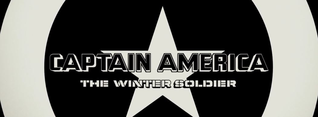
For my title sequence analysis, I decided to break down the opening
series to Captain America: The Winter Soldier due to it's use of
iconography and colour. The film also has strong war related themes
running through it's premise and title which links to our storyline for
our own final film.
The use of white with a bold font on the black background helps to make the names of the directors stand out. This will solidify that the audience will take note of who made the film so that they will contribute their names to the films overall success. It could also be connoted that the use of black and white is a reference to the cinematography that would have been used during the time of Captain America's initial stance in World War Two, giving links to the events that were explored in the first film.
The star is subsequently used as an edit from the first title to the next but is also utilized as iconography for the character of Captain America who is known for his extensive use of American propganda such as the colours of the United States flag and it's stars. This will thus give the audience an inclination into who the story is about and the potential settings that will be showcased. The use of non-diegetic music provides an upbeat almost orchestral tone to the title sequence indicating themes of power and glory.
The following title finally reveals the main character in his animated form. The use of red could symbolise 'danger' as it provides a stark contrast against the black and white backdrop. This could indicate to audiences the unsettled and morally ambiguous world in which the story is now set as well as foreboding the intentions of characters. The title sequence further addresses the underlying political and spy themes that run through Captain America's journey from a World War Two solider to a superhero in pursuit of menacing individuals.
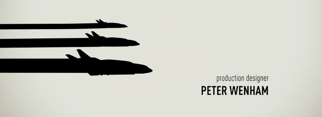
The planes are a nod to the industrialisation and innovation that is consistently taking place in modern society. They represent the thrilling aspect of the film, giving it's style a nod to a 70's conspiracy spy thriller through the use of silhouette, whilst also introducing the more advanced technology of the 21st century. It could be interpreted that the planes are symbolism for the journey that is about to take place whether it be through the character's own self discovery or an actual physical one.
The dynamic of the title sequence changes through the switch from a black and white theme to a red and white one. This could imply the change in time nevertheless the severity of the threat that Captain America is about to face. The use of graphics in the title sequence are a reference to the comic book background of the character as well as the style of the art that is commonly used in comic book storyboards. The recurring use of the flag iconography demonstrates the nationalism that the United States express as a country and portrays Captain America as a symbol and not just a person.
The close up shot of Captain America's silhouette breaking the glass with his shield could connote that the character is breaking through barriers and destroying the obstacles that have been put in place to slow him down. This further explores the character's heroism and determination, giving the audience an insight into the action packed genre of the film as well as a celebration of the character's personality. This draws attention to the stereoscopic style of the piece and manages to show off the complexity of the artwork whilst also relating to the plot.
The inclusion of red stops towards the end of Captain America's showcase and the title sequence returns to using a black and white theme. The character of Bucky only has red included on his star which could suggest that he has an aura of threat and danger about him. Nevertheless, it could also show the bond between Captain America and Bucky as friends because of them both having red stars on their uniform. The non-diegetic music continues to be dramatic at this point in the title showcasing the nature of the film. The use of the American flag as a shadow forebodes that Bucky has left his former self behind him and he is not the same person as before.
A female character is introduced in the next instalment of the title. The implication of a picture coupled with the compass shows that the woman is a person from Captain America's past and that she is potentially someone that he misses and/or cares deeply about. As well as the compass being a symbol of sentimentality, the object further signifies the past. The title regularly gives references to the World War Two background of Captain America whilst also giving small glimpses into the future. This documents that the character has strong ties to the past and forebodes that it will regularly come back to haunt him.
The bold white writing against the black backdrop makes sure that the Marvel Studios title stands out and reveals the content of the film. Marvel Studios is an American motion picture studio that has been releasing superhero based movies since 1993. Because of Marvel Studios strong stance in Hollywood and it's links to the recognisable and consistently popular Marvel comic books, the audience will be able to infer from this title what the film is going to be about and the types of characters that it is going to present. They know that with this film they will be dealing with a fantasy based plot so that anyone who is a fan of Horror or Comedy, won't necessarily be best suited to this film.
Finally, the main title appears to reveal the name of the film before running the full feature. This is done last so that the audience has the opportunity to be introduced to the film and notice which actors and companies have been involved in the production of it. The title sequence is also used as a way of giving the audience a glimpse into the storyline so that they can decide whether the film looks intriguing or not. The use of bold italic against the symbol of Captain America's black and white shield highlights the iconography of the character and his trademark weapon, causing excitement in the audience, as they anticipate what is about to happen to their favourite superhero.