
As our short film is a war drama I decided to look into war film posters. The one I decided to do is the film poster for 'War Horse' (Director: Steven Speilberg, 2011), I choses this becuase it is personally one of my favourite films, and also because it works well for the film. The title of the film is bold and stands out against the background making it easy for the viewer to read, also the fact that that it is placed top and centre of the poster it makes it more eye catching. A picture of Albert and Joey is set in the middle of the frame, which allows the audience to know who the main characters in the film are. 'Steven Spielberg' who directed the films, name is placed under the title, allowing the audience to know who directed the film. The quote 'Separated by war, Tested by battle, bound by friendship.' is symbolic of the film because it acknowledges the whole plot of the film. It gives a further insight into what the film is about and also the friendship between Joey and Albert. The use of orange tones connotes warmth and happiness which links to Joey and Albert's friendship as Albert keeps Joey warm, which in turn makes then both happy.

The 'Lasse Hallström' film Dear John (2010), is Romantic Drama, which has elements or war running throughout. The title of the film, 'Dear John' hints to one of the main plot points that also runs throughout the film. As the film is based of the novel by 'Nicholas Sparks' (indicated above the title) it was a hit in the cinema, which in turn lead to people reading the book. The picture is positioned centre frame, of the two main characters in the film, John and Savannah. It allows the audience to get to know the characters personality from the film, as they are quite close which could imply that they are in a relationship, or maybe very close friends. Linked with the picture is the name of the two actors 'Channing Tatum & Amanda Seyfried', this gives the audience information for them to then go out and potentially find out more about them or see what other films they have been in. The title of the film is in bold block letters, it is also in white and cream, which is able to catch the audiences eye. There is also production credits at the bottom of the poster in a smaller font which doesn't stand out as much as the title, however it is good to have one as it pays tribute to all the people who worked on the film. 'February' is printed in white which catches the audiences eye, this is the release date for America, which implies it is an American film poster. The use of the almost white sand in the background could connote loneliness, which contrasts with the dark blue tones of their cloths which connotes warmth.
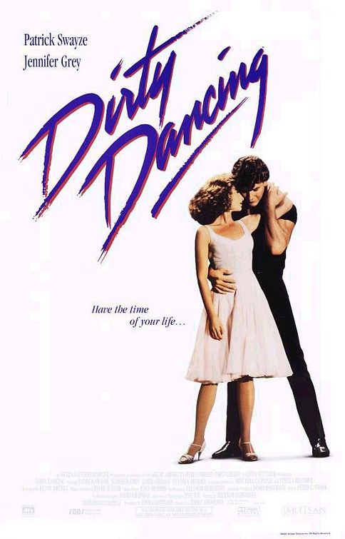
Dirty Dancing (Dir Emile Ardolin, 1987) has a simple film poster, staging just the main two characters, Baby and Johnny. The plain white background allows the characters and writing to stand out, a bold title catches the attention, which allows the readers eye to then be drawn to the picture and the small piece of writing which readers 'have the time of your life', referencing the final song of the film. Actor names are featured in the top left hand corner, informing people who stars in the film.

Doctor Strange (Dir Scott Derrickson, 2016) is an action, adventure staring Benedict Cumberbatch,
as a former neurosurgeon embarks on a journey of healing only to be drawn into the world of the mystic arts.The poster embodies the world of mystical arts aspect, through the kaleidascope effect with the buildings, this gives the effect of the film, and also adds a disorientateing effect. The colour scheme of keeping the background light allows text and Benedict to stand out. In contrast the vivid colours of Benedicts costume to stands out and allow the audience to see how the character looks in detail.
No comments:
Post a Comment